Inner London average salary comparison 2017
Gross average income in 2017 for full-time employees by local government district. An employee has to be in the same job for over 12 months. The data collected is Tax Year Ending. The income includes incentive payments.
| Area | Average salary |
|---|
| Waltham Forest | £31k |
| Enfield | £33.6k |
| United Kingdom | £35.4k |
| Lewisham | £35.5k |
| Greenwich | £35.6k |
| Haringey | £35.8k |
| Brent | £35.9k |
| Merton | £36.1k |
| Ealing | £36.1k |
| Barnet | £36.7k |
| Newham | £38.5k |
| Kensington and Chelsea | £38.8k |
| Wandsworth | £39.8k |
| Lambeth | £40.7k |
| Hackney | £42.5k |
| Southwark | £44k |
| Hammersmith and Fulham | £45.1k |
| Camden | £46k |
| Islington | £52.7k |
| Westminster | £60.1k |
| Tower Hamlets | £75.2k |
| City of London | £80.6k |
Inner London median salary comparison 2017
Gross median income in 2017 for full-time employees including incentive payments. Median income divides the income distribution into two equal groups, half having income above that amount, and half having income below that amount.
| Area | Median salary |
|---|
| Waltham Forest | £28.3k |
| United Kingdom | £28.8k |
| Enfield | £28.8k |
| Merton | £29.7k |
| Brent | £30.1k |
| Ealing | £30.4k |
| Newham | £30.8k |
| Haringey | £31.4k |
| Kensington and Chelsea | £32k |
| Barnet | £32.1k |
| Greenwich | £32.4k |
| Wandsworth | £32.9k |
| Hackney | £33.6k |
| Lewisham | £33.8k |
| Lambeth | £35.1k |
| Hammersmith and Fulham | £36.9k |
| Southwark | £37.6k |
| Camden | £38.1k |
| Islington | £39.3k |
| Westminster | £42.3k |
| Tower Hamlets | £49.5k |
| City of London | £56.3k |
Inner London unemployment rate comparison 2017

| Area | Unemployment rate |
|---|
| Wandsworth | 3.6% |
| Merton | 4% |
| United Kingdom | 4.4% |
| Barnet | 4.4% |
| Hackney | 4.7% |
| Islington | 4.7% |
| Lambeth | 4.8% |
| Lewisham | 4.9% |
| Ealing | 5% |
| Camden | 5.2% |
| Waltham Forest | 5.2% |
| Hammersmith and Fulham | 5.4% |
| Westminster | 5.6% |
| Newham | 5.7% |
| Greenwich | 5.9% |
| Enfield | 6% |
| Kensington and Chelsea | 6% |
| Brent | 6.3% |
| Southwark | 6.3% |
| Haringey | 6.5% |
| Tower Hamlets | 8.1% |
Inner London average salary
Gross average income in 2017 for full-time employees. An employee has to be in the same job for over 12 months. The data collected is Tax Year Ending. The income includes incentive payments.

Inner London median salary
Gross annual median income for full-time employees including incentive payments.

Inner London unemployment rate

Inner London net household income map
Map shows net average household income in 2016 by middle layer super output area (MSOA). The lowest household income was in Enfield 030, with £27.8k. The area with the highest average income was Tower Hamlets 033, with £93.8k. Median income was £38.1k - i.e. half of the areas had income equal or above £38.1k. Median income for England and Wales was 31.9k ( the lowest income was in Leeds 086, £16.8k, the highest in Tower Hamlets 033, £93.8k).
| Name | Net income |
|---|
| lowest | Enfield 030 | £27.8k |
| median | | £38.1k |
| highest | Tower Hamlets 033 | £93.8k |
Inner London relative housing costs map
The map below shows housing costs share of net household income. The higher share of income costs take the darker color is displayed. An equivalisation scale and different models for income before housing costs and after housing costs may results in a few inconsitencies. Although there are some inconsistencies, it does not change significantly the overall picture of area comparison.
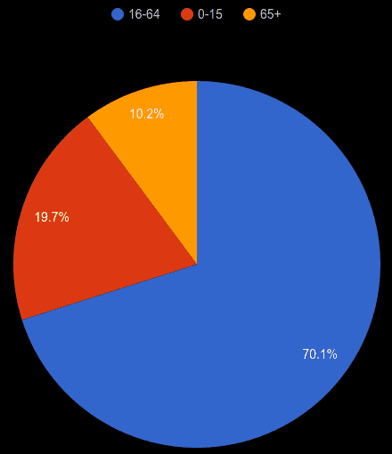
Inner London working age population share
2017 population estimates.

Related reports


